Dola
Devanagari Typeface
AREAS
TYPE DESIGN
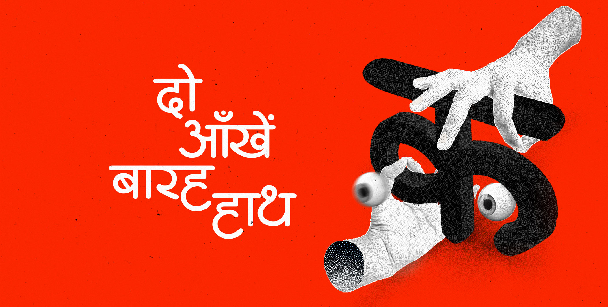
The project started off as a classroom assignment at IDC IIT Bombay under the guidance of Prof. Girish Dalvi where we were briefed to revive a devanagari typeface. The lettering used in the movie title card of ‘2 Aankhen 12 Haath’ was taken as a starting point for this exercise.

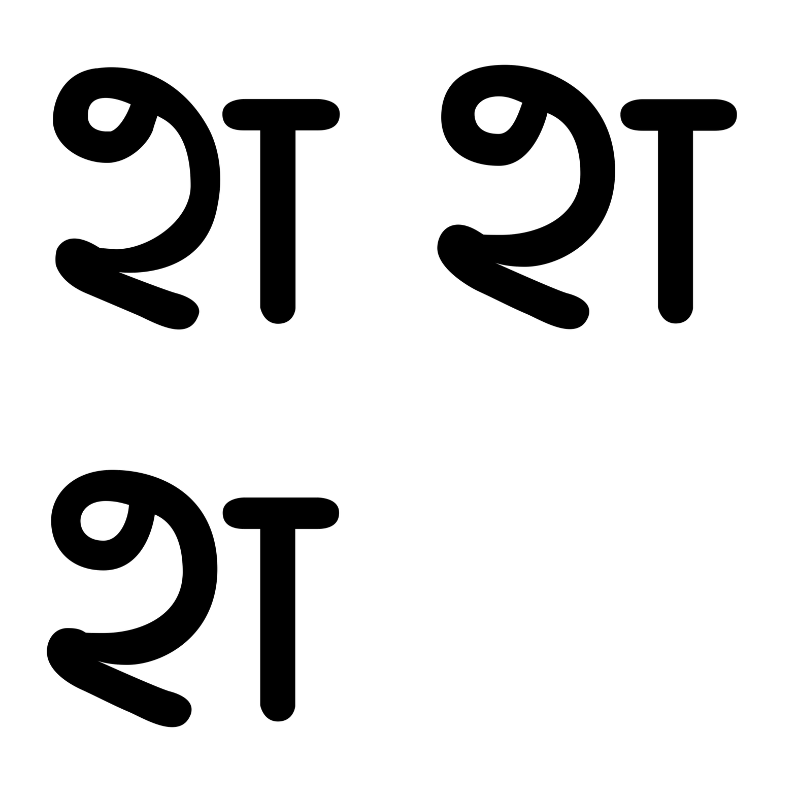
The typeface is based on the beautiful hand lettered words राजकमल कलामन्दिर below the main title. There is a flamboyance to the lettering in the way the brush has moved to create it, the proportions lend a sense of eccentricity to it. There is a certain rhythm to the way it moves across the screen.

Design Process
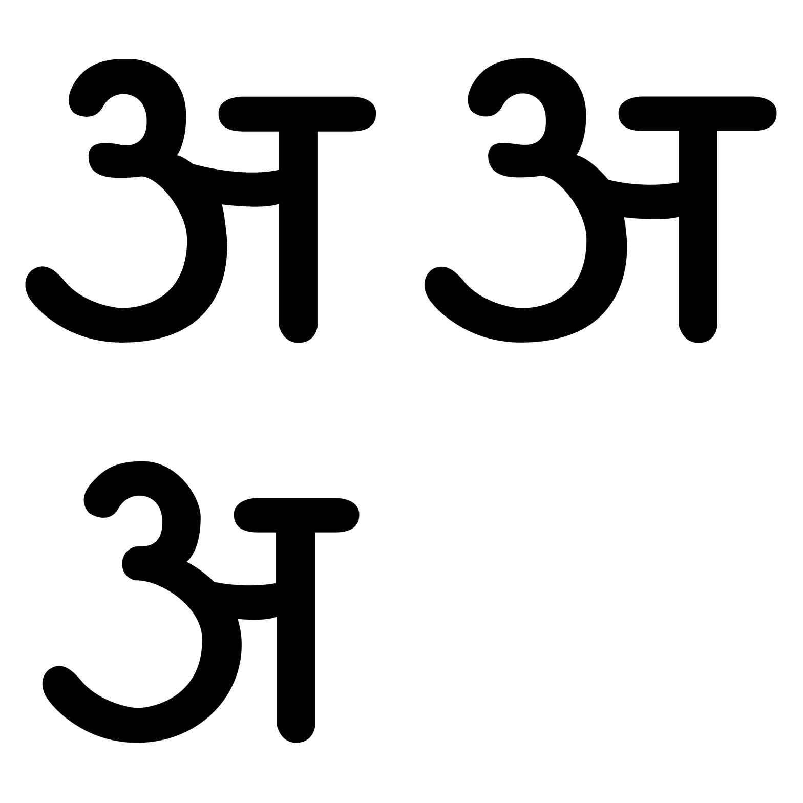
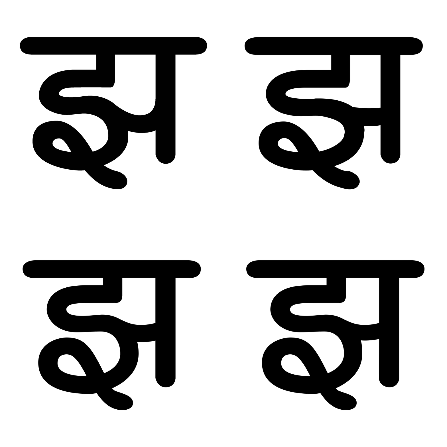
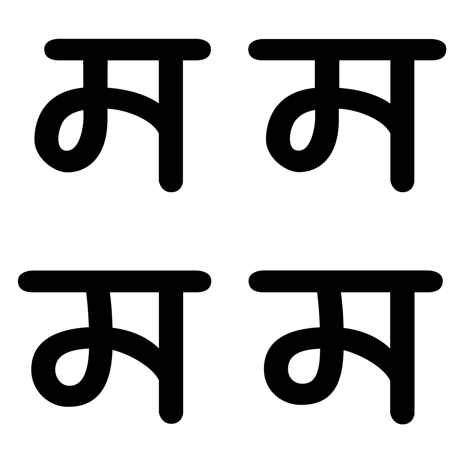
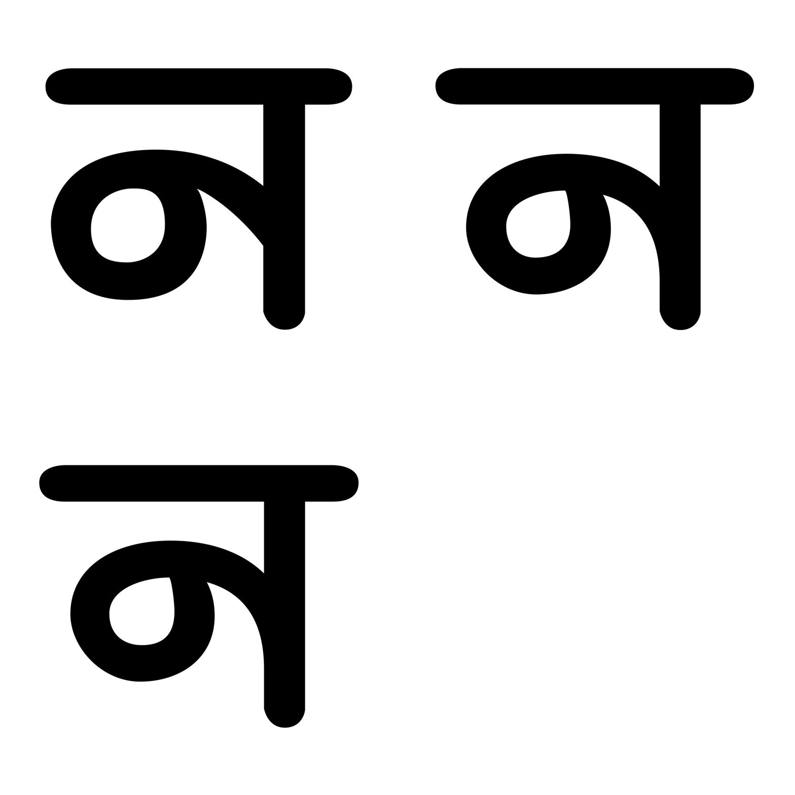
Designers/painters of these movie titles tended to paint the same characters in different ways which provides you with a lot of options to choose from. Every option seems right in its own sense. We categorized the characters into groups based on morphological features. Categorising the primitives helps in deriving the characters whose prototypes are not available from the ones that are available.
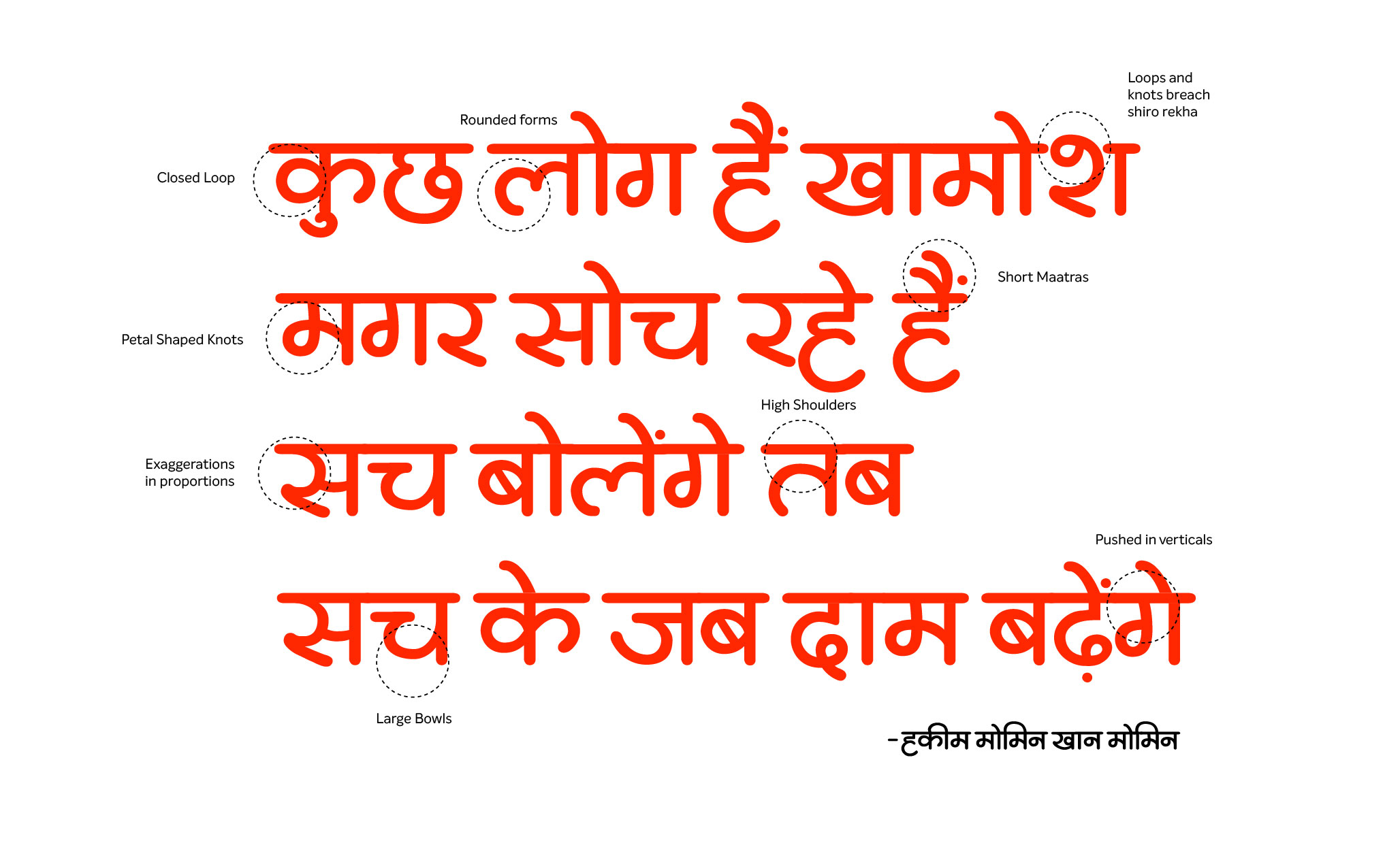
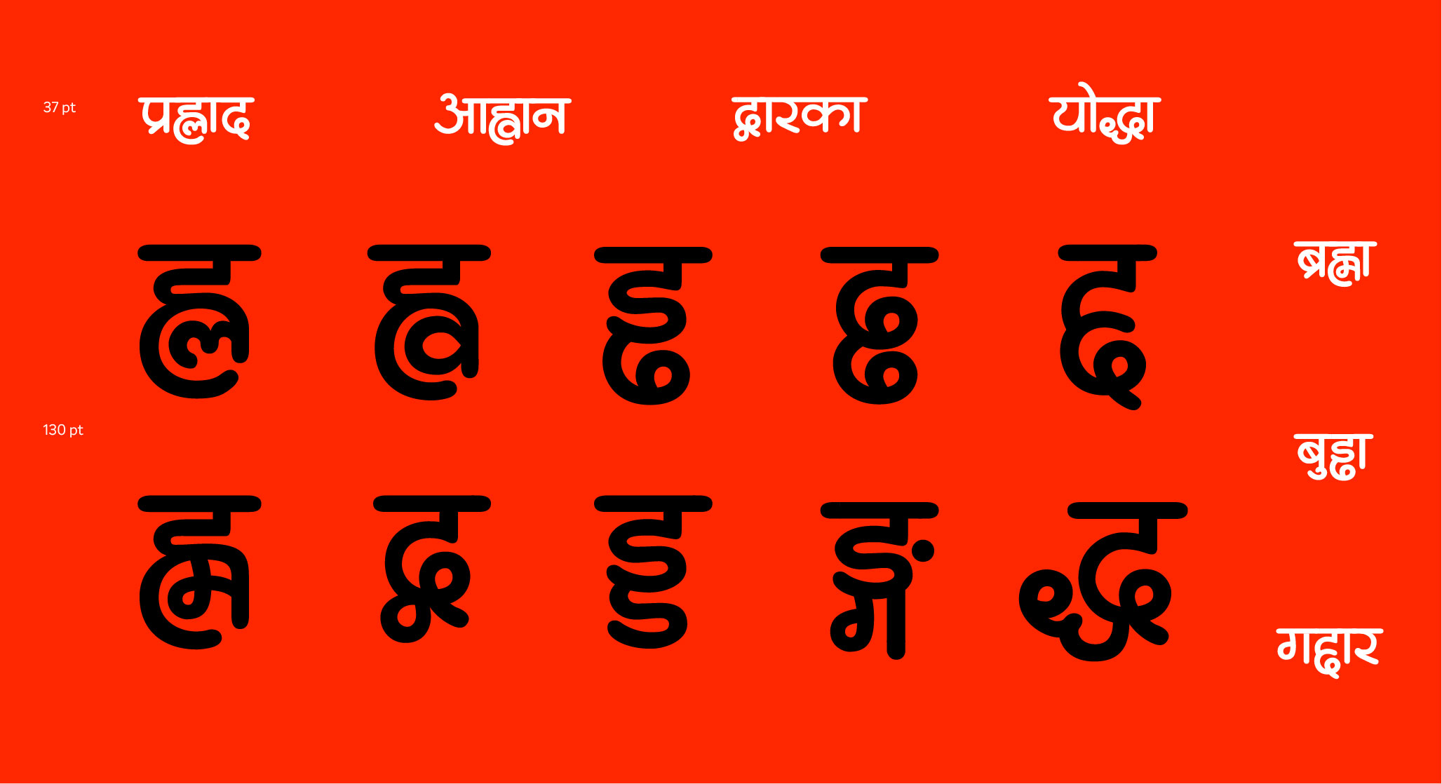
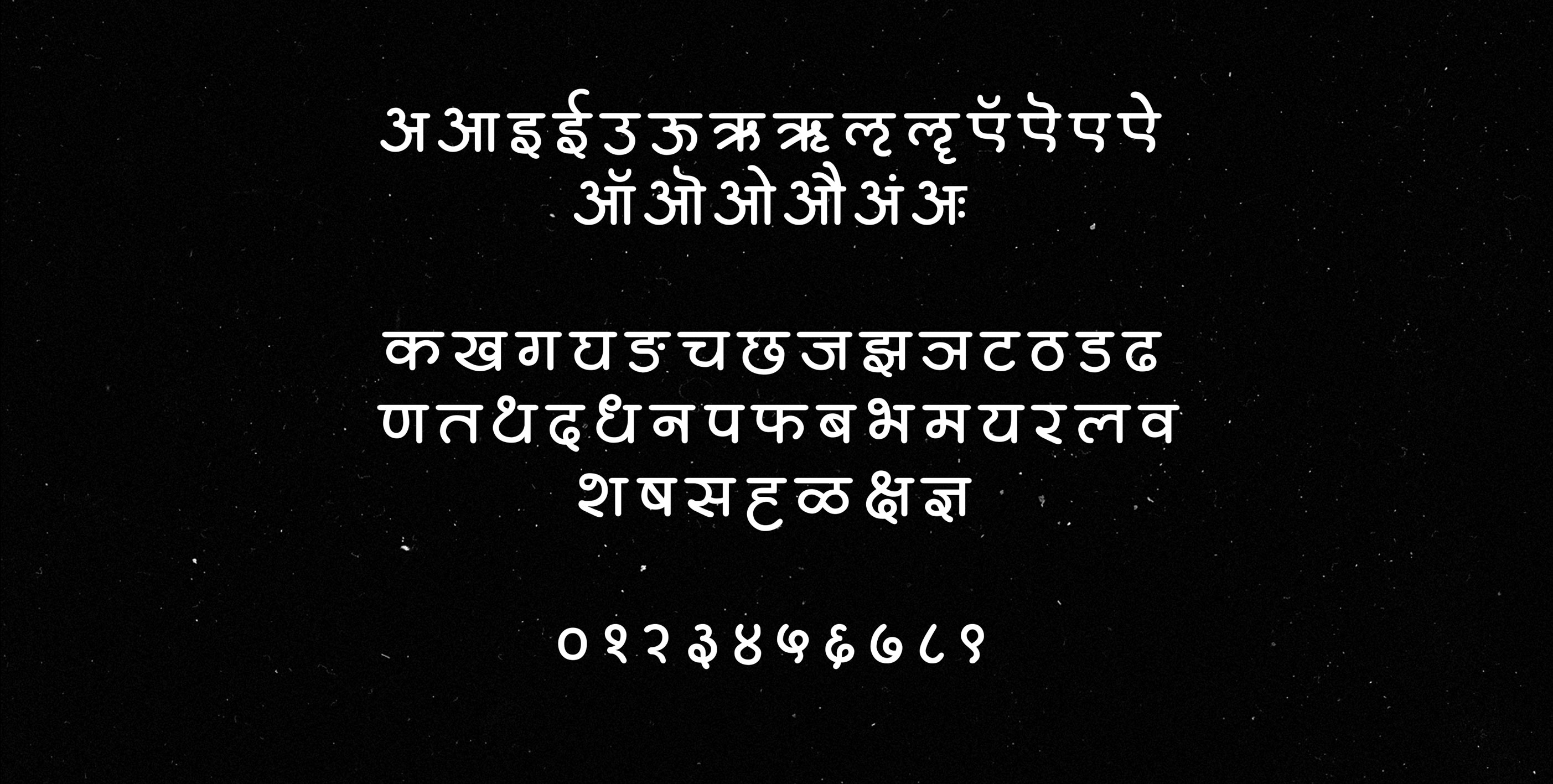
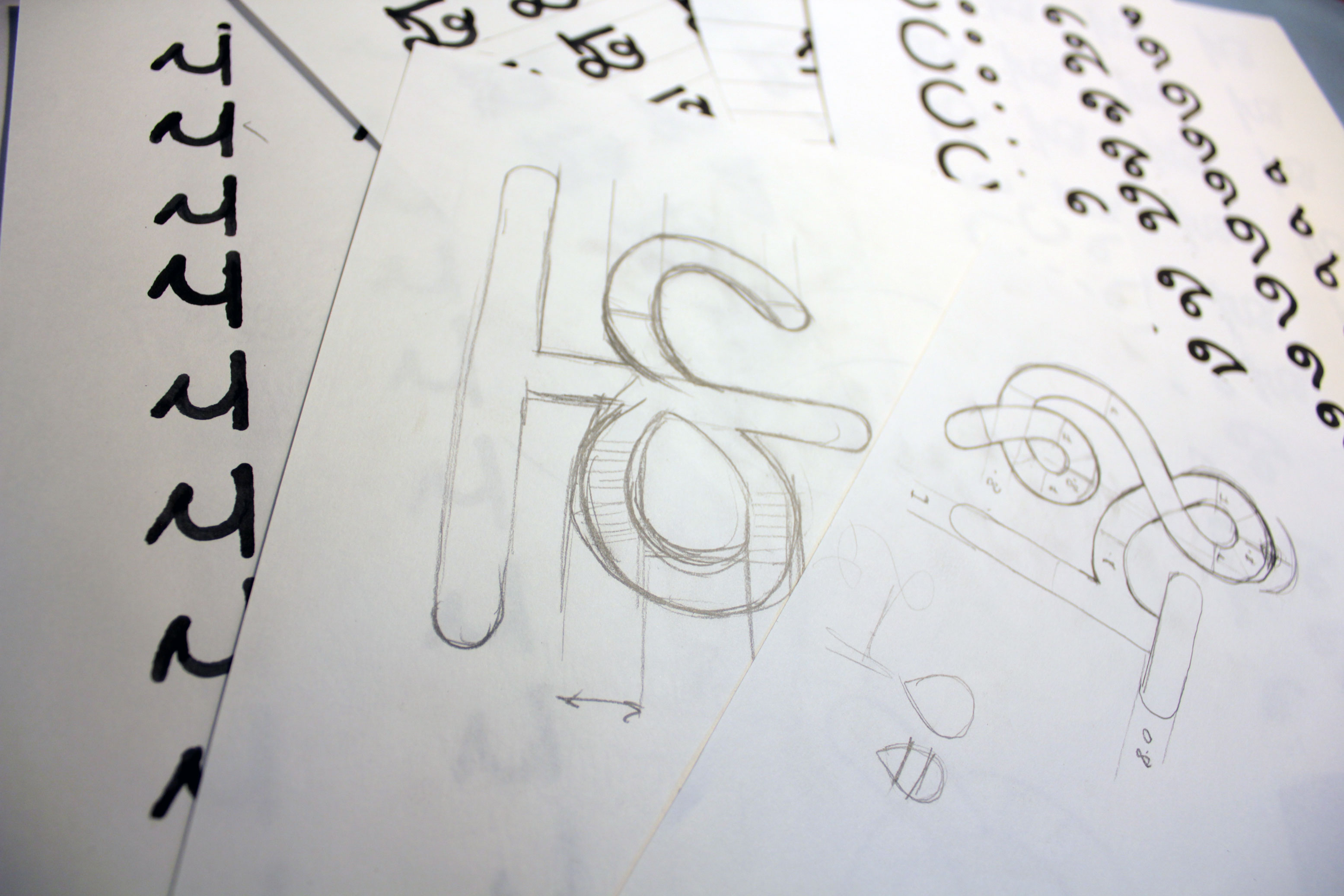
Numerous iterations were done to get the visual features right. We formed certain rules that would guide the design process of the glyphs and maintain the cohesiveness of visual features across all glyphs. Final glyphs were drawn out since the screen shots were unreliable of due to low resolution, aberration and blurriness.
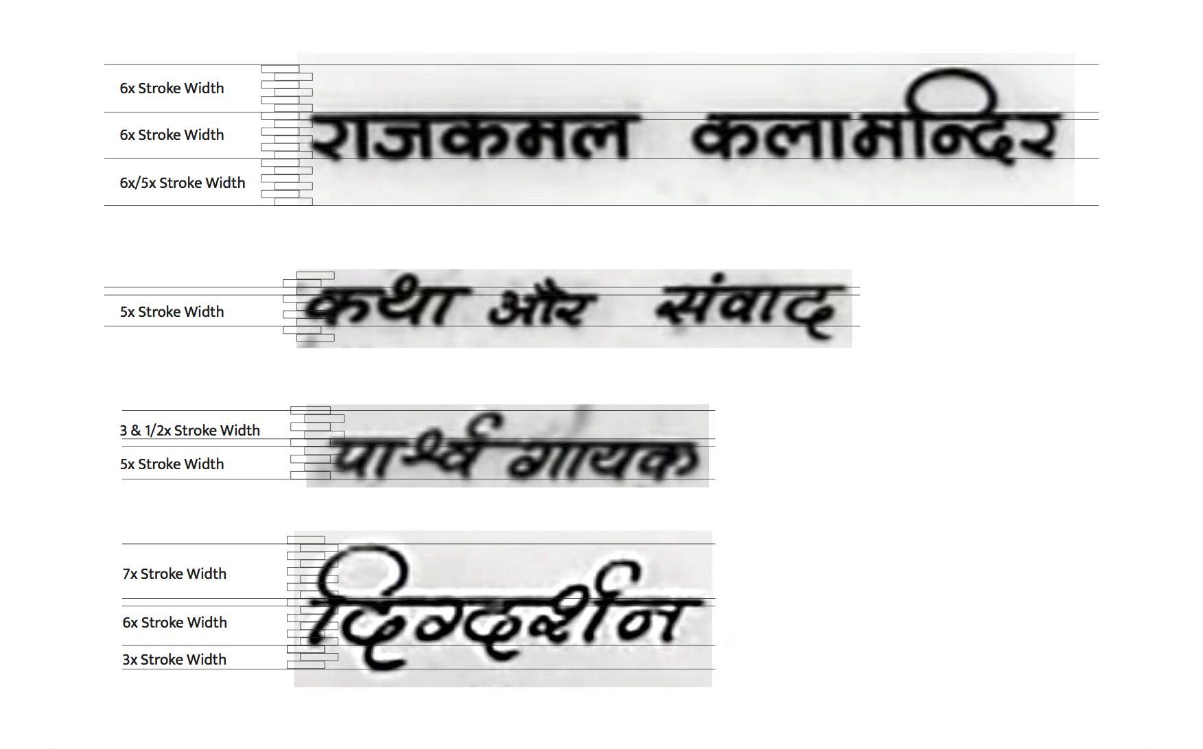

Analyzing prototypical characters

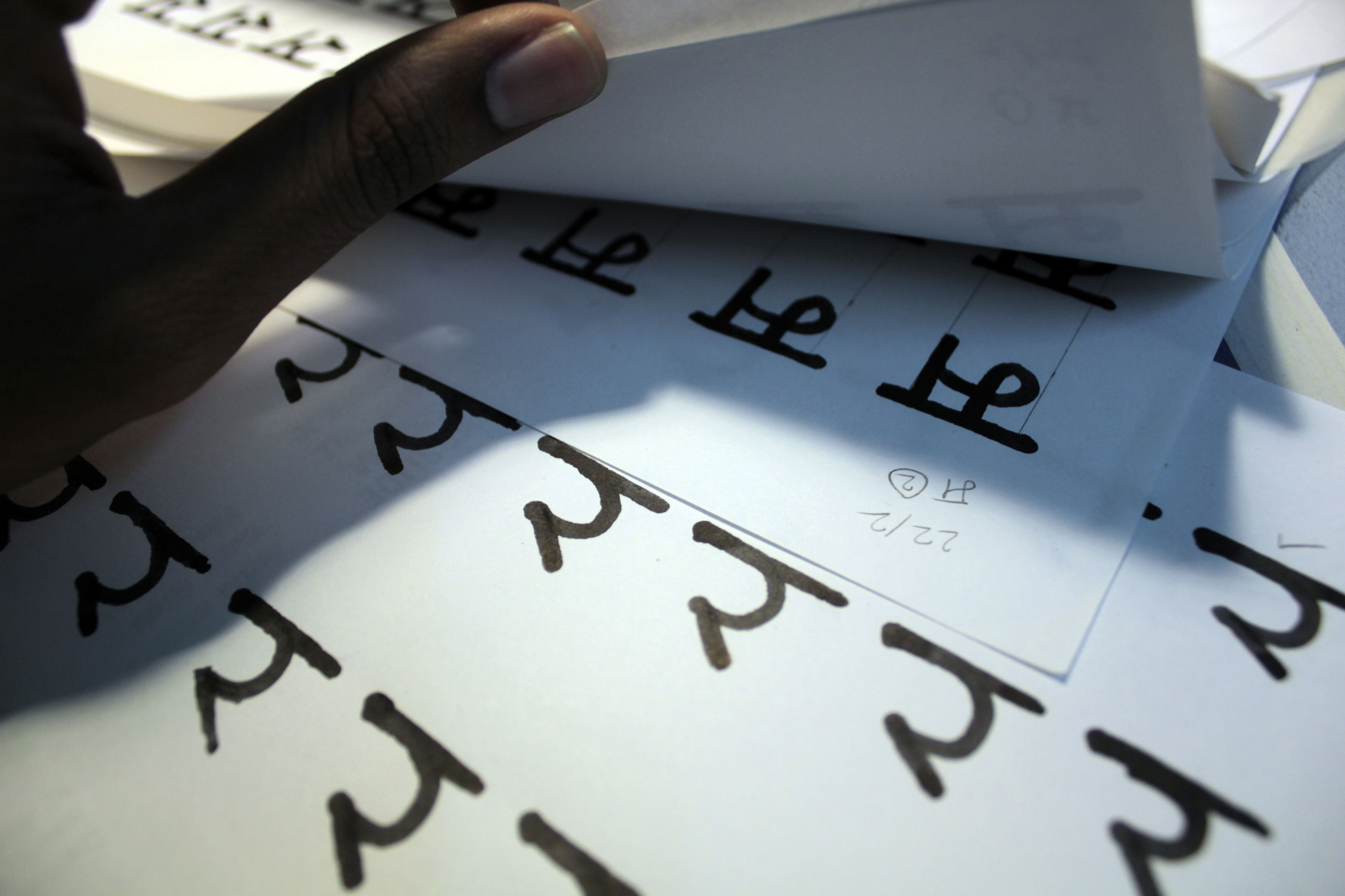
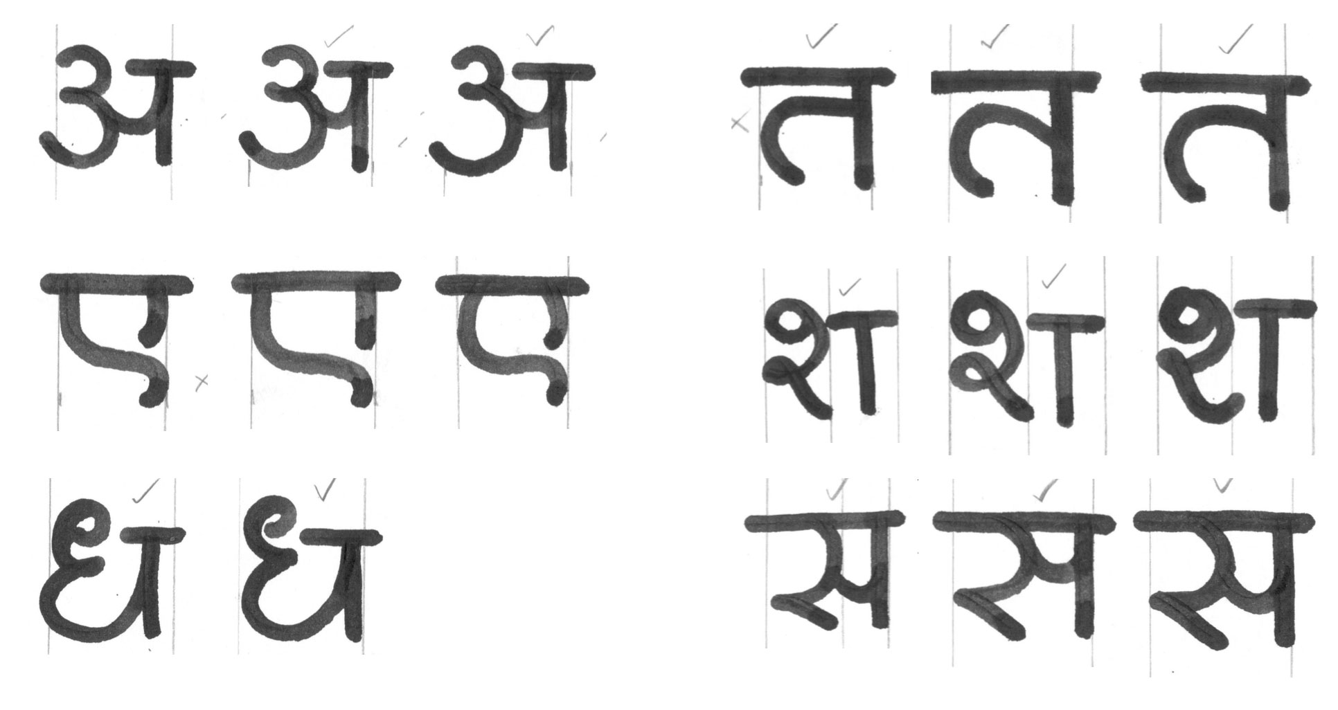
Calligraphic explorations
Evolution of glyphs
