One price doesn’t fit all - AIP Dashboard
AREAS
UI, UX, Research, Prototyping
PROJECT DONE AT OLX AUTOS
2022
TEAM
Nitin Shekhar
Pratyush Maheshwari
Aditya Gupta
Akshita Rastogi
TLDR;
At OLX Autos, I designed the UX and UI for an automated data driven pricing dashboard to help the local pricing teams get better at knowing What car to buy, How many cars to buy and what price to buy it at.
HIGHLIGHTS
- Cars with AIP dashboard had
51% higher procurement compared to legacy pricing methods.
Launched Milestone 1 meeting tool adoption targets
THE PROBLEM
At OLX Autos the pricing teams needed an automated data driven pricing tool to track competitor pricing, set prices along each stage of the pricing journey and adapt their pricing strategy as per geographical and market factors.
In the world of pre-owned cars, where customers have more choice than ever before, price can be a deal-breaker. Pricing is the major factor in a potential customer’s buying and selling decision. We learnt it the hard way documented in this case study. Effective pricing requires keeping a pulse check on the shifts in consumer behaviour, effective inventory management and presents the need to approach pricing differently depending on geographical and market factors.
PROJECT GOAL
Building an intuitive platform that enabled local pricing teams to track market trends, configure pricing strategies, and adopt prices at a granular level.

TRACK
Drawing actionable insights from vast quantities of data.
Provide recommendations for car selling price to the local pricing team by tracking the market & competitor prices.
An interactive widget to capture the user’s attention right from the beginning of the flow and drive them to the sell flow faster.

CONFIGURE
Taking strategic decisions
as per market trends
Build a system that suggests a market closing price, allows markets to decide which price to use and to set a quote price on the basis of the selected market price and manual margin input (a.k.a liquidity factor).
An interactive widget to capture the user’s attention right from the beginning of the flow and drive them to the sell flow faster.

ADOPT
Enabling a granular approach to pricing
Entry Points
Machine learning models allows our pricing team to take a granular approach by understanding price according to a car’s condition, projected margins, inventory days, among other factors. AI empowered our pricing team to move away from a one-size-fits-all approach.
An interactive widget to capture the user’s attention right from the beginning of the flow and drive them to the sell flow faster.

APPROACH
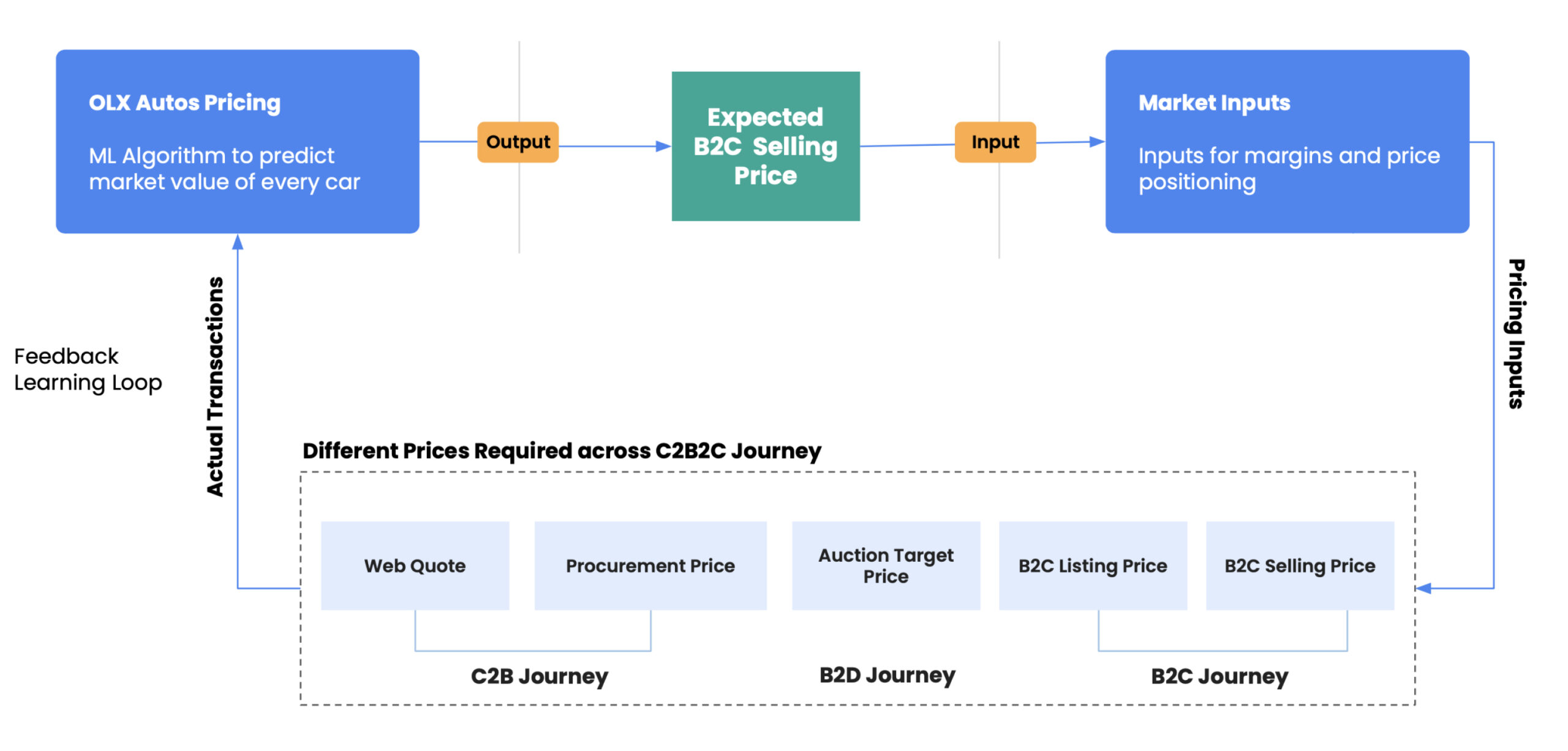
To get this project rolling, we needed to gain a thorough understanding of the different stages of a car's pricing journey.
Each stage requires taking multiple strategic decisions about the margins to be achieved, usage and damage related discount factors and a view on data science model recommendations. We carried out in-depth discussions with our global stakeholders where we gathered requirements and cleared our understanding. We gathered that there are three stages of a car’s journey in our system.

C2B (Customer to Business)
Web quote - Price quoted to customer in online flow before self-inspection
Procurement Price - Price a car is bought at from the customer.
An interactive widget to capture the user’s attention right from the beginning of the flow and drive them to the sell flow faster.

B2D (Business to Dealer)
- Auction Target Price - Our expected / target Auction price for any given car attributes.
An interactive widget to capture the user’s attention right from the beginning of the flow and drive them to the sell flow faster.

B2C (Business to Customer)
Entry Points
- B2C Listing Price - Our expected / target price for the given car attributes
- B2C Selling Price - Price a car is sold (retail / customer sell-out transaction) to the customer.
An interactive widget to capture the user’s attention right from the beginning of the flow and drive them to the sell flow faster.
AIP DASHBOARD
A self learning loop
UX DISTILLING
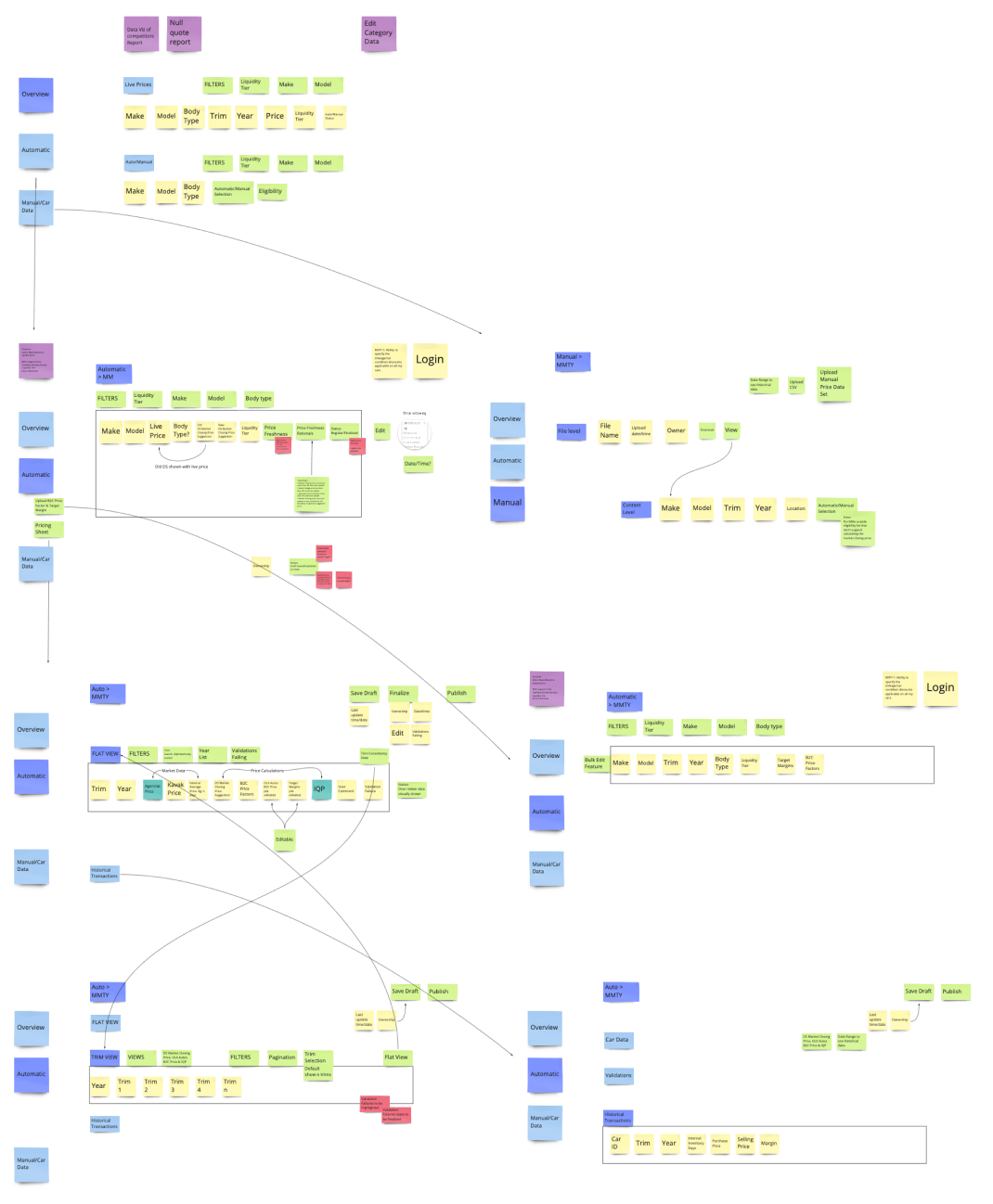
With an understanding of the pricing journey we created a user flow of the various sections, data points, and user task flows with all the decision-making points.
Since we were on a tight deadline, we followed a design methodology called UX distilling which takes care of the requirements and wireframing processes together. We fleshed out the dashboard structure by listing out every important function the dashboard could need as sticky notes and categorized them into navigations, data and features/use cases.
With all the requirements on sticky notes, we moved them around in the wireframe to see what worked best and what could overlap. We went through several rounds of revision with our stakeholders at this stage refining the stickies down to what was absolutely essential.
Information Architecture
- Communicating the value proposition along with the 3 -4 key benefits upfront. Primary CTA is kept above the fold.
- Testimonials that are relatable with raw/ selfie videos for more social proofing.
- Steps to selling fast / how it works. Persistent chat / contact us floater, that works as a trust marker and also helps us catch leads from all places in the flow.
- Request a call back from the customer care representative
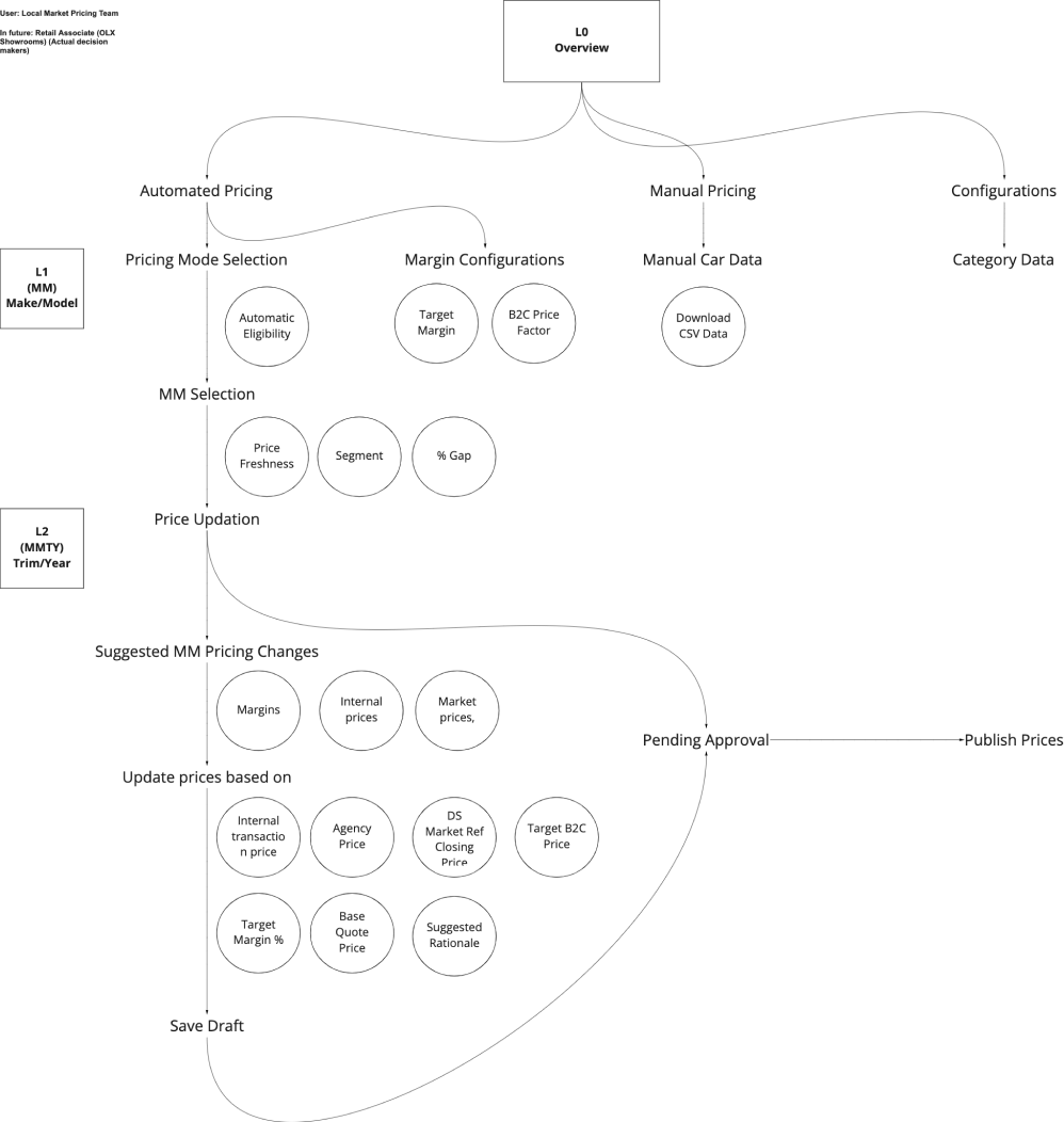
Dashboard Structure Categorization
- Communicating the value proposition along with the 3 -4 key benefits upfront. Primary CTA is kept above the fold.
- Testimonials that are relatable with raw/ selfie videos for more social proofing.
- Steps to selling fast / how it works. Persistent chat / contact us floater, that works as a trust marker and also helps us catch leads from all places in the flow.
- Request a call back from the customer care representative
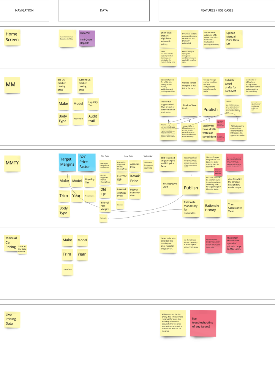
Sticky Note Wireframes
- Communicating the value proposition along with the 3 -4 key benefits upfront. Primary CTA is kept above the fold.
- Testimonials that are relatable with raw/ selfie videos for more social proofing.
- Steps to selling fast / how it works. Persistent chat / contact us floater, that works as a trust marker and also helps us catch leads from all places in the flow.
- Request a call back from the customer care representative
DESIGN
We realized that for this product to work, it needed to address 3 key design challenges.
CHALLENGE 1
Browse through thousands of pricing data points to understand the whole set of information or a part of it.
Data is useless without the ability to visualize and act on it. The success of OLX Autos in the used car market combines advanced data collection with better user experience for our pricing teams, and the data table comprises much of this user experience. Good data tables allow users to scan, analyze, compare, filter, sort, and manipulate information to derive insights and commit actions.
Inline editing allows the user to change data without navigating to a separate details view. Expandable rows allow the user to evaluate additional information without losing their context. Showing multiple data points with their statuses as coloured labels enabled pricing teams to be on top of their inventory.
Data table with various features to help pricing teams be on top of their inventory.
Image Title
Bulk selection and editing to quickly make wider changes.
Image Title
CHALLENGE 2
View, edit or compare different data points, draw conclusions and execute actions efficiently.
Bulk editing is a powerful tool which is very popular in “complicated product” world. It’s designed to help users finish their tasks quickly and reduce muscle work. In AIP Dashboard bulk editing is used to support a variety of actions, such as editing, multi selection, filtering, labelling, bulk changing states, moving, or deleting. Basic filtering allows users to manipulate the data presented in the table.
CHALLENGE 3
Find required data points, to explore them further, extract interesting insights.
It’s merely a big table of numbers – until you turn it into a heat-map. Only then do some values jump out visually. The heat-map enabled our pricing teams to quickly skim the table for outliers and patterns in the data. Different data views enabled users to customise the data and sort accordingly.

Heat maps to help identify outliers in car pricing.
Image Title
IMPACT
With Milestone 1 launch, we priced 30% of our overall quotes by automatic pricing.

HIGHER PROCUREMENTS
Cars with automatic pricing have 51% higher procurement compared to legacy manual pricing.
An interactive widget to capture the user’s attention right from the beginning of the flow and drive them to the sell flow faster.

IMPROVED MARGINS
~1.5% pp Higher B2C margin
An interactive widget to capture the user’s attention right from the beginning of the flow and drive them to the sell flow faster.

BETTER PREDICTION
Entry Points
AIP Dashboard is better at predicting the selling price of the car by 3.2%
An interactive widget to capture the user’s attention right from the beginning of the flow and drive them to the sell flow faster.
LEARNINGS
A thorough understanding of the sell journey.
Stakeholder management
Streamlining the design phase by employing a new application distilling process.
Data table design is the most unglamorously beautiful design work there is.
Tables tend to have a somewhat (undeserved) bad reputation in the world of digital interfaces. They are often perceived as cold and overwhelming. Yet in so many cases they are the most efficient way to organize complex information in a digestible manner. A well-thought-out table interaction experience in enterprise software design can enhance clarity, ease users’ lives and maximize the data’s potential.
© Nitin Shekhar
© Nitin Shekhar
[email protected]
+91 996 778 4886