A New hope: Building the OLX Autos
Transaction Platform
AREAS
UI, UX, Research, Prototyping
PROJECT DONE AT OLX AUTOS
2021
TEAM
Akshita Rastogi
Shalab Vaishnav
Nitin Shekhar
Ankur Sardana
Ashoka Prem
Liquid Ink Design Team
Ranga, Abhishek, Sneha, Sakshi
TLDR;
OLX Autos recognised the need to shed the baggage of our older classifieds app and design a brand-spankin'-new car-focused app experience that would knock our users’ socks off. We explored features from a mobile first perspective, pushing the envelope of the user experience while taking the learnings from our classifieds app and improving upon them. In addition to this, I also took on the role of art direction to ensure that the overall visual language, motion design and photography was consistent and visually appealing.
HIGHLIGHTS
- It's not every day that you get to redesign a product from the ground up, especially at a big ol' corporate like OLX. But when you do it definitely ends up as a highlight.
- In user testing, our users loved features such as stories and onboarding with customised curation.
- Younger users favoured the new video view and older users found the 360 view unrealistic. But mostly they agreed on using the gallery view.
INTRODUCTION
As we geared up to launch OLX Autos app in Mexico and Chile, we recognised the need for a new, efficient app experience. The older OLX Classifieds app had a dated UX and UI which lacked important functionalities, resulting in poor usability leading to poor conversion.
We didn't just want to fix the issues with the old app - we wanted to create something truly special, something that would be more user-friendly and inspire trust in our users. The Classifieds app was designed with desktop browsers as a priority. We wanted to explore features from a mobile-first perspective, pushing the envelope of the user experience. We knew that some features and flows would exist as it is from previous experiences. We wanted to take the learnings from our classifieds app and improve upon them. So, we put our heads together and got to work, designing and developing a brand-spankin'-new car-focused app experience that would knock our users’ socks off.
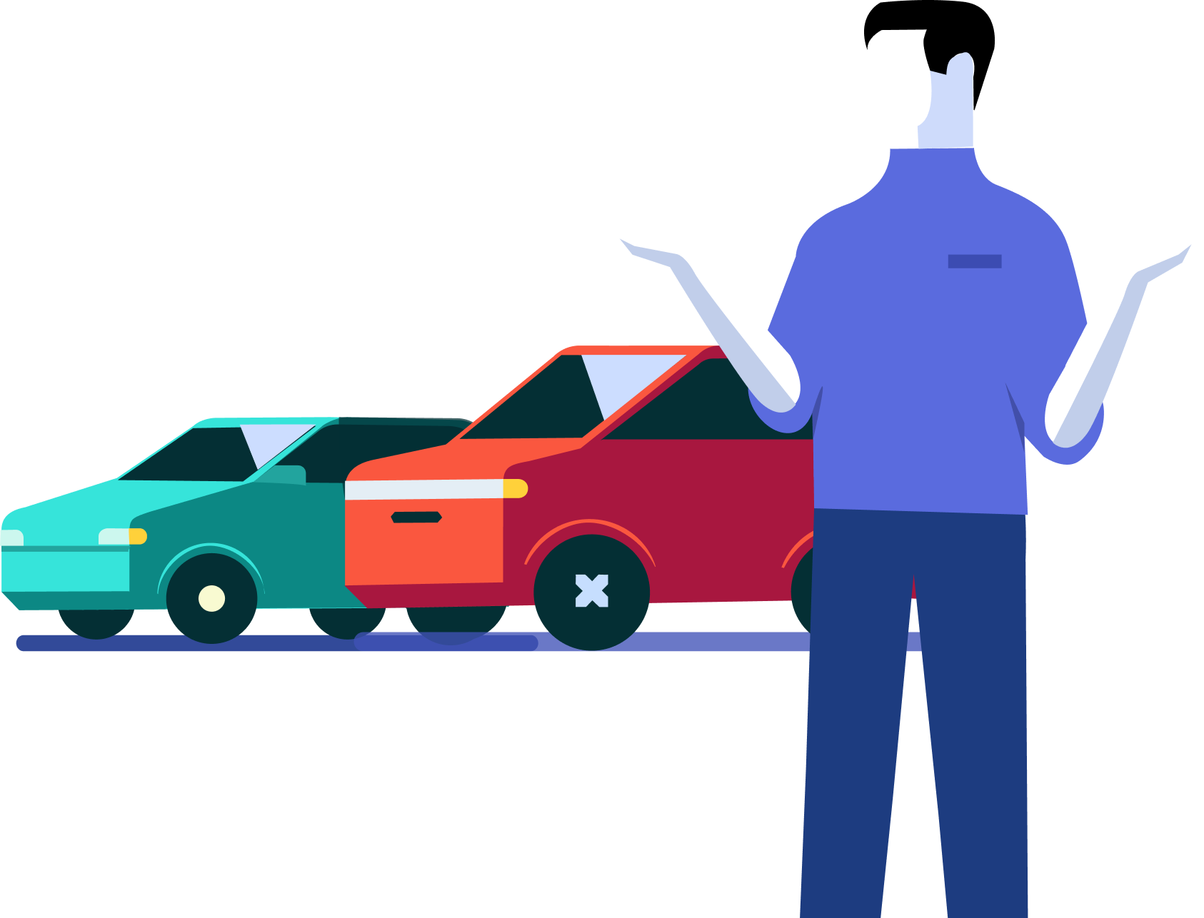
Issues with the old OLX Classifieds app
Now, before we get into the nitty-gritty details, let's take a quick look at what was wrong with the old app, shall we?

Bad navigation and Complicated CJM (Customer Journey Map)
The older classifieds app was an old relic from a bygone era, the design seemed oblivious to the rising tide of mobile internet.
An interactive widget to capture the user’s attention right from the beginning of the flow and drive them to the sell flow faster.

Low
conversion rate
The dated look of the older app along with a dated UX led to low trust in C2B2C business offerings.
An interactive widget to capture the user’s attention right from the beginning of the flow and drive them to the sell flow faster.

Lacked personalization
for each customer.
Entry Points
We lacked interactive widgets to capture the user’s attention right from the beginning of the flow and drive them to the sell flow faster.
An interactive widget to capture the user’s attention right from the beginning of the flow and drive them to the sell flow faster.

Illustrations
vs.
Reality
In research after research, we got to know that people preferred looking at real humans in environments that they recognized than the icons and illustrations we had prominently used in the classifieds app. We lacked a proper image bank for the car transactions business.
An interactive widget to capture the user’s attention right from the beginning of the flow and drive them to the sell flow faster.

Not specifically designed for
car transactions.
Entry Points
Lacked important functionalities like looking at a car from every nook and cranny and gauging the love that the previous owner gave this car. And what if you don’t have the cash on you right now, there was no way to get loans.
An interactive widget to capture the user’s attention right from the beginning of the flow and drive them to the sell flow faster.

Looked old
and dated
Entry Points
OLX classifieds was designed during a time when mobile internet was a joke for a generation that was just abandoning internet explorer.
An interactive widget to capture the user’s attention right from the beginning of the flow and drive them to the sell flow faster.
DISCOVERY:
Through in-depth Zoom interviews our research team gave us the tea on what users expect from our platform.
Now, it's not every day that you get to redesign a product from the ground up, especially at a big ol' corporate like OLX. But when you do you have to say you are up for the challenge to re-think about the product from the ground up. We worked with our customers to understand what their needs were.
With sizing/segmentation exercises the research team provided us with the user’s expectations from the platform
Image Title
Sellers
When it comes to selling, our users want trust, speed, and transparency in the process.
They're looking for the best possible price and a personalised, fast, and easy car selling journey. And who can blame them? They want to get the best deals and check out cars worth upgrading for.
Of course, they want end-to-end handholding and user education at each critical stage.
They needed a personalised service that saves time and effort, including home pick-up, home inspection, and all the info they need about the cars they're selling.

Buyers
Buyers want trust, transparency, and convenience in the buying process.
They're looking for a variety of options for their shortlisted car models and need a secure platform with financial features like end-to-end online transactions, trade-in facility, and loans.
Our users want to negotiate, reserve cars, and get the best and newest model in town.
They also want transparency and all the details available on the website itself, like original invoices, insurance documents, maintenance history, and accidental history.
And of course, they need guidance and handholding at each stage.
Buyers want trust, transparency, and convenience in the buying process.
- They're looking for a variety of options for their shortlisted car models and need a secure platform with financial features like end-to-end online transactions, trade-in facility, and loans.
- Our users want to negotiate, reserve cars, and get the best and newest model in town.
- They also want transparency and all the details available on the website itself, like original invoices, insurance documents, maintenance history, and accidental history.
And of course, they need guidance and handholding at each stage.
FROM FINDINGS TO FEATURES
We had numerous brainstorming sessions and interviews with all key stakeholders, and we came up with some pretty nifty designing principles and feature directions.

Designing for
"Trust"
Now, let's talk about designing for humans. We're all about the tone of voice, communication, and copy that emphasizes security, transparency, and education. We also developed art direction guidelines for content, imagery, and motion.
An interactive widget to capture the user’s attention right from the beginning of the flow and drive them to the sell flow faster.

Designing for
"Loyalty"
For returning users, we're continuing with content curation, prioritization, and recommendations based on intent, location, and other factors. We're giving you a tracking feature for your buying, selling, financing, and trade-in journeys, as well as a wish-list, shortlist, and favorites.
An interactive widget to capture the user’s attention right from the beginning of the flow and drive them to the sell flow faster.

Designing for
"On the move Users"
Entry Points
For those of you on the move, we've got some cool features in store. We're talking quick explore, powerful and smart search, seamless checkout, and instant pricing. We're taking advantage of device capabilities, including the camera, for quick information gathering. And we're all about using a centralized system for the source of truth, like Zoop.
An interactive widget to capture the user’s attention right from the beginning of the flow and drive them to the sell flow faster.

Designing for
"First Time Users"
We'll onboard you swiftly and give you a login contextually. We're all about relevant entry points and redirection, with no dead ends. When it comes to personalization, we're all over it. We're talking content curation, home screen widget/dashboard recommendations, and a customized onboarding experience. We're capturing intent and directing folks to their main task without any fuss.
An interactive widget to capture the user’s attention right from the beginning of the flow and drive them to the sell flow faster.

Designing for
"Delight"
When it comes to accessibility, we wanted to use bottom sheets more efficiently, designing for one-hand operation, and making sure the visual themes are easy on the eyes. Plus, we kept in mind cognitive design and reduced the need for typing wherever possible.
An interactive widget to capture the user’s attention right from the beginning of the flow and drive them to the sell flow faster.
Designing for "First Time Users"
We had a bunch of different personas we needed to address, like The Family Man, Car Enthusiast,and Newbie.
We wanted to make sure our users had a personalised experience, with the help of our research team we identified three questions to help us understand what they were looking for.
And if they skipped the onboarding flow, we asked them again later, like a friendly nudge in the right direction. And we even encourage them to edit their preferences later on, so they could always have a custom experience.

Personalisation widget
between car listings
Image Title
Onboarding questions to understand
what our users are looking for
Image Title
Onboarding animations, from mockups to final animation
- Communicating the value proposition along with the 3 -4 key benefits upfront. Primary CTA is kept above the fold.
- Testimonials that are relatable with raw/ selfie videos for more social proofing.
- Steps to selling fast / how it works. Persistent chat / contact us floater, that works as a trust marker and also helps us catch leads from all places in the flow.
- Request a call back from the customer care representative
Designing for "Delight"
Our old Ad Detail Page was a bit of a mess, with information floating all over the place. We knew we needed to make it more efficient and user-friendly. Our users want transparency with images that showed the real condition of the car.

Our research suggested that people only retain about 10% of what they hear or read after three days. But if you pair that same info with a relevant image, boom, they remember 65% of it.
We also gathered that there was content that is better understood in the context of imagery and content without the context of imagery but still important for decision making.
We made sure to include plenty of comprehensive car photos, video player and a 360 degree car view with dent maps and feature markers to give our users instant information about the vehicle visually, without having to read through a ton of text.

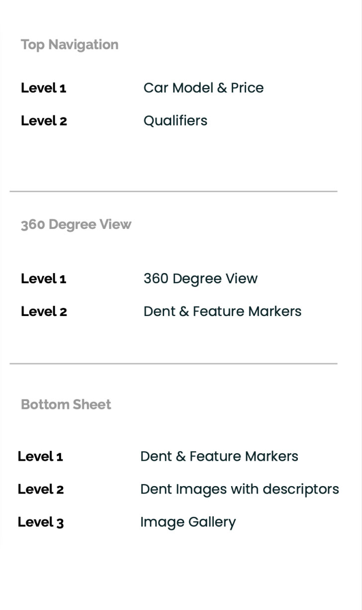
360 DEGREE CAR VIEW
The 360-degree view was at the centre of our experience, to look at the car from every nook and cranny right from wherever they are.
We divided and organised everything on the screen into three sections (Top Nav, 360 Degree View, Bottom Sheet) and made it so that the users can seamlessly switch between them.
Gallery view prototype
Image Title
- Communicating the value proposition along with the 3 -4 key benefits upfront. Primary CTA is kept above the fold.
- Testimonials that are relatable with raw/ selfie videos for more social proofing.
- Steps to selling fast / how it works. Persistent chat / contact us floater, that works as a trust marker and also helps us catch leads from all places in the flow.
- Request a call back from the customer care representative
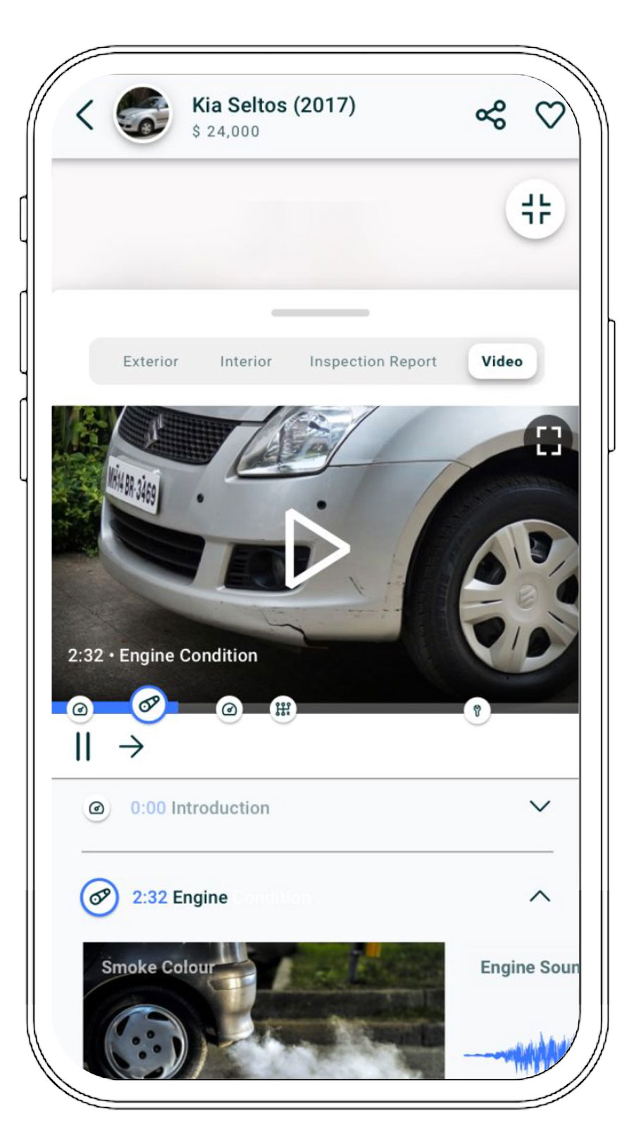
Video Reviews with chapter markers
Image Title
- Communicating the value proposition along with the 3 -4 key benefits upfront. Primary CTA is kept above the fold.
- Testimonials that are relatable with raw/ selfie videos for more social proofing.
- Steps to selling fast / how it works. Persistent chat / contact us floater, that works as a trust marker and also helps us catch leads from all places in the flow.
- Request a call back from the customer care representative
VIDEO REVIEWS WITH CHAPTER MARKERS
We designed a section for video reviews with real car reviews from our inspectors with chapter markers, so users could jump around and find the info they needed.
** Context: From past research in the LATAM region, we've learned that videos add to the trust factor as users feel pictures are easily editable but videos are difficult to tamper with. Competition uses manual video process/drone video recording of cars.
Designing for "On the move Users"
By now we have established that it’s better to show than tell, right? Well, we went a step further and decided to shake things up by redesigning our car listing cards as stories. Our three goals? Make it efficient, engaging, and if possible, turn it into something delightful.
EACH CAR HAS IT’S OWN STORY
Now, stories are a bit different from your usual listings. Instead of bombarding you with a ton of info all at once, they take things one story at a time, giving you a chance to dive deep into what you're interested in. And they do it all in just 7 seconds (15 seconds if there's a video), taking advantage of every inch of your screen real estate. You get to shortlist, share, view car details and compare it with other cars. The video content would be shot with templates right on the screen for our inspectors.
Additionally, we included features such as sharing, add-to-compare, and shortlisting to let users choose their dream cars. Adding social proofing indicators such as views and shortlisted count so that other people, or even better, familiar people, like the content can remove decision-making uncertainty. Crucial car details called qualifiers can be swiped up into view to see more details in the ad detail page.
OLX Classifieds Listings
Image Title
- Communicating the value proposition along with the 3 -4 key benefits upfront. Primary CTA is kept above the fold.
- Testimonials that are relatable with raw/ selfie videos for more social proofing.
- Steps to selling fast / how it works. Persistent chat / contact us floater, that works as a trust marker and also helps us catch leads from all places in the flow.
- Request a call back from the customer care representative
OLX Stories Prototype
Image Title
- Communicating the value proposition along with the 3 -4 key benefits upfront. Primary CTA is kept above the fold.
- Testimonials that are relatable with raw/ selfie videos for more social proofing.
- Steps to selling fast / how it works. Persistent chat / contact us floater, that works as a trust marker and also helps us catch leads from all places in the flow.
- Request a call back from the customer care representative
We borrowed the familiar circular stories buttons from Instagram and Snapchat and gave them an OLX Autos twist. We used them to show off popular or featured cars, recommend vehicles based on user profiles, and categorize them by type (offroad, family, city driving, etc.).

Designing for "Trust"
We wanted to update our image bank to reflect the new Latin American audience we were introducing OLX Autos to. And I got the opportunity to drive the art direction on the project.
Together with the LATAM marketing team, we developed mood boards, shot lists, locations, camera angles, and lighting. And let me tell you, these personas from the research team were invaluable in shaping what kind of scenarios and models we would shoot for our lifestyle shots.
We commissioned a local agency to execute the shoot in Mexico and Chile, capturing users using the app in environments that were familiar and relatable to them. It was a blast seeing your vision come to life!

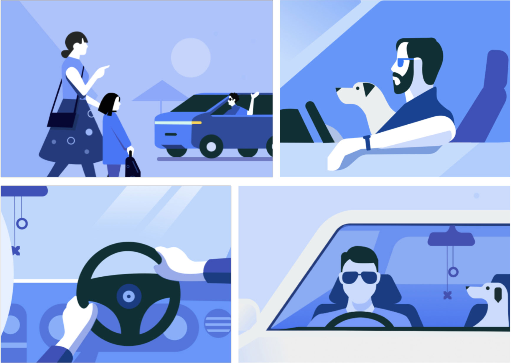
PARTNERING WITH LIQUID INK DESIGN
We partnered with Liquid Ink’s design team in building a visual language for our Autos business that is globally relatable, clever, and confident.
The library of illustrations, onboarding, and icons was designed to create a universal feeling of pride and empowerment and move & flex through a playful storytelling of the car trading process.
GESTURE BASED INTERACTIONS
When it comes to interactions, we wanted to shake things up with new interaction paradigms. But don't worry, we're keeping things familiar and predictable with widely accepted gestures, functional animations, and transitions. We added micro-interactions for feedback and delightful animations for a little extra fun.
Peek & Pop
When the user performs a prolonged touch on the thumbnail, a light box where a user can “peek” or preview the content. If the user continues to press, the content “pops” over the active screen the user can find the ad detail page.
- Communicating the value proposition along with the 3 -4 key benefits upfront. Primary CTA is kept above the fold.
- Testimonials that are relatable with raw/ selfie videos for more social proofing.
- Steps to selling fast / how it works. Persistent chat / contact us floater, that works as a trust marker and also helps us catch leads from all places in the flow.
- Request a call back from the customer care representative
Gliding Collection
Gliding collection is a smooth and flowing interaction where clutter is reduced with collapsible categories.
- Communicating the value proposition along with the 3 -4 key benefits upfront. Primary CTA is kept above the fold.
- Testimonials that are relatable with raw/ selfie videos for more social proofing.
- Steps to selling fast / how it works. Persistent chat / contact us floater, that works as a trust marker and also helps us catch leads from all places in the flow.
- Request a call back from the customer care representative
Drag to compare
Power users can drag to add to their compare lists. We even included an FTU message to guide our users.
- Communicating the value proposition along with the 3 -4 key benefits upfront. Primary CTA is kept above the fold.
- Testimonials that are relatable with raw/ selfie videos for more social proofing.
- Steps to selling fast / how it works. Persistent chat / contact us floater, that works as a trust marker and also helps us catch leads from all places in the flow.
- Request a call back from the customer care representative
DESIGN VALIDATION
Are you ready for the moment of truth? As OLX Autos geared up to develop its first-ever transactions experience in the LATAM market, it was critical to understand user perspective and feedback on specific features, before getting into the development phase. Here's what they had to say
"This is faster; I found it helpful. Imagine that I can't stay to see details of this car (referring to ADP); I will look at the story very quickly, and after that, I will save this in my favorites list to check later in my house."
- Communicating the value proposition along with the 3 -4 key benefits upfront. Primary CTA is kept above the fold.
- Testimonials that are relatable with raw/ selfie videos for more social proofing.
- Steps to selling fast / how it works. Persistent chat / contact us floater, that works as a trust marker and also helps us catch leads from all places in the flow.
- Request a call back from the customer care representative
Our users love the stories feature!
They appreciate the unique visual experience it offers and acknowledge that it saves time when searching through cars. Some family buyers find this feature interesting, but they don't report a specific intention to use it. The reason being - they open platforms like OLX Autos to do a precise search, not to explore something different.
- Communicating the value proposition along with the 3 -4 key benefits upfront. Primary CTA is kept above the fold.
- Testimonials that are relatable with raw/ selfie videos for more social proofing.
- Steps to selling fast / how it works. Persistent chat / contact us floater, that works as a trust marker and also helps us catch leads from all places in the flow.
- Request a call back from the customer care representative
"I love the questions; they can help you find a better car for you; it is also effortless. Additionally, I will open an open category; maybe you are a housewife."
- Communicating the value proposition along with the 3 -4 key benefits upfront. Primary CTA is kept above the fold.
- Testimonials that are relatable with raw/ selfie videos for more social proofing.
- Steps to selling fast / how it works. Persistent chat / contact us floater, that works as a trust marker and also helps us catch leads from all places in the flow.
- Request a call back from the customer care representative
Onboarding & User Profiling lent a helpful hand
Most users felt that the onboarding process was good, fast, and easy - especially those who already know what car they want to buy. However, some users found it annoying if they already knew what they wanted.
- Communicating the value proposition along with the 3 -4 key benefits upfront. Primary CTA is kept above the fold.
- Testimonials that are relatable with raw/ selfie videos for more social proofing.
- Steps to selling fast / how it works. Persistent chat / contact us floater, that works as a trust marker and also helps us catch leads from all places in the flow.
- Request a call back from the customer care representative
"This feels unreal; I prefer the gallery view" “I've seen this (referring to 360 views) in other apps, and I see that the quality of the photos drops a lot. So I would choose the gallery view instead.”
- Communicating the value proposition along with the 3 -4 key benefits upfront. Primary CTA is kept above the fold.
- Testimonials that are relatable with raw/ selfie videos for more social proofing.
- Steps to selling fast / how it works. Persistent chat / contact us floater, that works as a trust marker and also helps us catch leads from all places in the flow.
- Request a call back from the customer care representative
ADP Gallery over video and 360 views!
Research showed that users prioritize the gallery view when searching for cars. Younger users favored the video view, but older users found the 360 view unrealistic. Also, car detail summary or qualifier view within 360 view goes unnoticed and often gets overshadowed by the pictures. Gallery was the preferred method to find more information about the car. Users want to see multiple photographs with information
- Communicating the value proposition along with the 3 -4 key benefits upfront. Primary CTA is kept above the fold.
- Testimonials that are relatable with raw/ selfie videos for more social proofing.
- Steps to selling fast / how it works. Persistent chat / contact us floater, that works as a trust marker and also helps us catch leads from all places in the flow.
- Request a call back from the customer care representative
In conclusion, the journey of designing and developing the OLX Autos platform was an exciting one. It was a challenging task, but one that we embraced with open arms.
We kept the user at the center of everything we did, and it showed in the final product. And while it's bittersweet to say that OLX Autos as a business vertical is being sold off/shut down, I'm proud of what we accomplished during my time there. If you want to learn more about my work or have any questions, don't be shy, hit me up!
© Nitin Shekhar
© Nitin Shekhar
[email protected]
+91 996 778 4886